Rapid Turnaround Branding, How to Get Quality Designs Without Losing Consistency
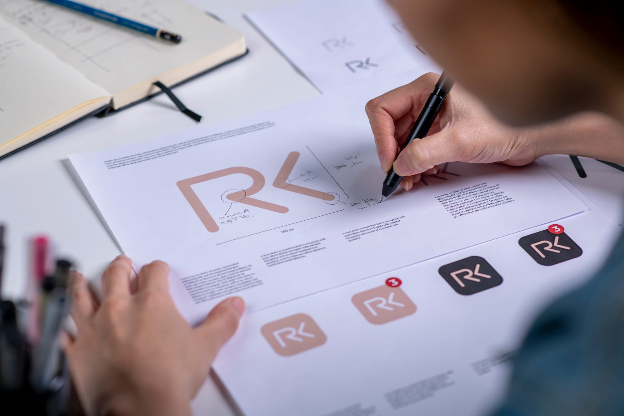
Rapid turnaround branding works only when consistency is non negotiable. If you are pushing for same day or next day design delivery, the biggest risk is not speed, it is visual drift. A logo gets stretched, colors shift, typography changes, and your audience experiences your brand as unreliable. The goal is simple, deliver fast while keeping every design aligned to one clear system.
The fastest way to protect consistency is to build a small, usable brand kit before you rush production. You do not need a 40 page guideline document to move quickly. You need a compact set of decisions that every design can follow, every time.
- Logo set: primary, secondary, icon, and one monochrome version, plus spacing rules.
- Color palette: 3 to 6 core colors with exact HEX values, plus 1 to 2 neutrals.
- Typography: 1 heading font, 1 body font, and sizing examples for common formats.
- Layout rules: preferred margins, grid, and where your logo typically sits.
- Image style: photo or illustration direction, filters, contrast, and subjects to avoid.
- Voice cues: 3 to 5 words that describe tone, for example bold, friendly, premium.
Once those pieces exist, speed becomes safer because designers are no longer inventing basics on every job. They are executing a repeatable recipe.
Rapid turnaround does not mean skipping strategy, it means standardizing it. At Dave Art Studio, the quickest branding projects succeed when we turn strategy into templates, checklists, and approved building blocks. That way, each new deliverable is a variation within the system, not a brand reset.
Use a “core first” production plan. When deadlines are tight, prioritize the brand items that influence everything else. Build them in this order to reduce rework.
- Foundation: logo refinements, palette, type, and basic usage rules.
- High visibility assets: social profile image, cover banner, business card, email signature.
- Sales drivers: flyer, promo post set, ad graphics, product one pager.
- Scaled library: story templates, carousel layouts, branded icons, print variations.
This approach keeps your public facing touchpoints consistent early, even if the full asset library is still expanding.
Make “consistency checkpoints” part of every fast design cycle. A quick project needs quick quality control. Add two short reviews that never get skipped.
- Checkpoint 1, brand compliance: colors, fonts, logo sizing, spacing, and alignment rules.
- Checkpoint 2, message clarity: headline readability, hierarchy, and call to action visibility.
These checkpoints can be done in minutes, but they prevent the common problem where a design looks good on its own yet feels off brand in a feed, on a shelf, or in an inbox.
Speed improves when your feedback is structured. Unclear feedback is the biggest cause of “fast” projects becoming slow. Replace open ended comments with a simple approval method.
- One decision maker: appoint a single final approver to avoid conflicting edits.
- One consolidated feedback list: collect all notes in one message, grouped by priority.
- Ask for changes, not preferences: specify what to adjust and why, for example “increase contrast for accessibility” instead of “make it pop.”
- Limit rounds: plan for one main revision round, and one polish round.
When clients can respond quickly and clearly, rapid turnaround becomes realistic without sacrificing quality.
Template systems are the secret weapon for consistent fast branding. Templates are not “cookie cutter” if they are built from your brand rules. A strong template set includes multiple layouts for the same content type, so your brand stays recognizable without looking repetitive.
- Social post templates for announcements, testimonials, tips, and promotions.
- Story templates for quick updates, polls, countdowns, and product highlights.
- Print templates for flyers, event posters, and simple menus.
- Digital templates for presentations, proposals, and lead magnets.
With templates, you reduce design time, reduce decision fatigue, and keep every output visually aligned.
Protect your files with a clean asset library. In fast production, people grab whatever file is easiest to find. If the correct file is not obvious, the wrong file gets used. Set up one shared folder with clear naming, and include only approved assets.
- Logos labeled by use, for example “Primary Color,” “Mono,” and “Icon.”
- Fonts or font links, plus usage notes.
- Color codes in a single reference file.
- Approved photos, textures, and icon sets.
- Export presets, for example Instagram square, story, A4 print, and web banner.
Know what “quality” means before you start. Quality is not only aesthetics. For rapid turnaround branding, define quality as a checklist that can be verified quickly.
- Readable at small sizes, especially on mobile screens.
- Correct file formats, for example PNG for transparency, PDF for print.
- Color accuracy, including print safe conversions when needed.
- Accessibility basics, like sufficient contrast for text.
- Consistency with existing brand pieces across channels.
How Dave Art Studio helps you move fast without visual drift. Our rapid turnaround workflow is built around three promises. First, we start with a lightweight brand kit that sets rules early. Second, we design using repeatable systems like templates and approved asset libraries. Third, we use fast checkpoints that catch inconsistencies before delivery. The result is professional quality output that still feels like one brand, not a different designer every time.
If you want rapid turnaround and long term brand consistency, start with systems. Put the brand kit, templates, checkpoints, and feedback process in place. Then you can scale production quickly while keeping every design recognizable, credible, and on message.