10 High Converting Flyer Layouts, Grid Rules, and Spacing Tips for Fast Turnaround Projects
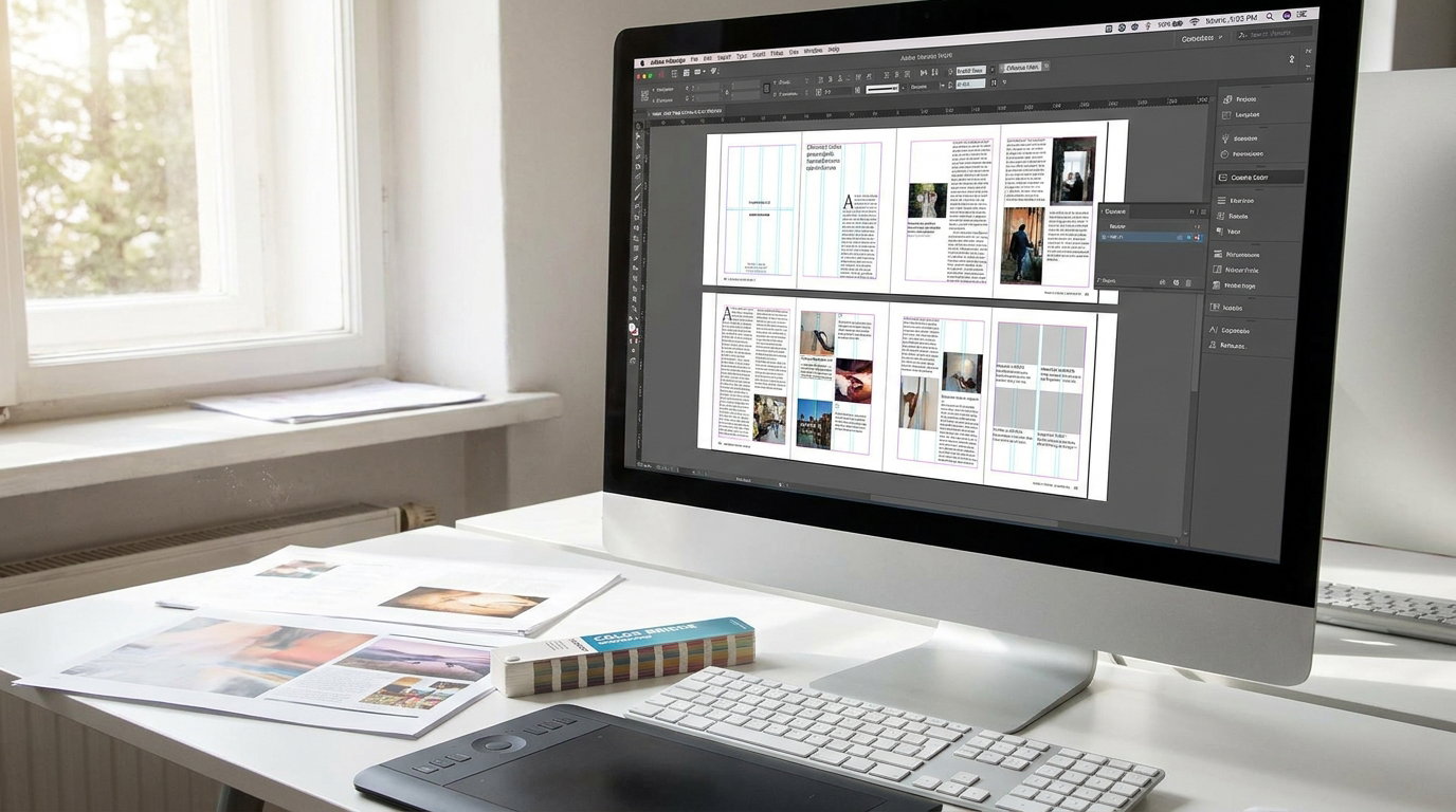
Fast turnaround does not have to mean rushed design. At Dave Art Studio, we rely on repeatable flyer structures that keep layouts clean, on brand, and conversion focused, even when the deadline is tight. The key is choosing a proven layout, applying simple grid rules, and using consistent spacing so the message reads instantly.
Below are 10 high converting flyer layouts you can reuse across events, promos, service menus, and product launches, plus grid and spacing tips for each so you can move from brief to print ready quickly.
1) Classic hero plus details (top image, bottom info)
Best for events, product promos, and new launches. Place one strong hero visual at the top, then stack the offer, supporting details, and call to action below.
Grid rule: Use a simple 1 column grid with 6 to 8 horizontal bands, so each section has a dedicated zone.
Spacing tip: Give the hero 35 to 45 percent of the height, then keep consistent vertical gaps, for example 16 to 24 px between sections.2) Z pattern scan layout
Great for audiences that skim. Put your logo top left, headline top right, supporting visual in the middle, and CTA bottom right. This matches natural scanning flow.
Grid rule: Build a 12 column grid, then anchor key elements to columns 1 to 4, 5 to 8, and 9 to 12.
Spacing tip: Keep outer margins generous, at least 0.5 inch for print, so the Z path stays readable and not cramped.3) Big number or big offer layout
Perfect for discounts, limited time deals, and bundles. Make the percentage or price the hero, then explain the value quickly underneath.
Grid rule: Use a 2 column grid. Reserve the left column for the big number, the right for benefits and terms.
Spacing tip: Add extra breathing room around the big number. Negative space increases perceived value and reduces visual noise.4) Split screen layout (image left, copy right)
Ideal for service flyers, coaching, or real estate. The image sells the vibe, the copy sells the details.
Grid rule: Use a 50 50 split, or a 60 40 split if the photo is strong. Lock both halves to the same baseline grid.
Spacing tip: Add a vertical gutter between halves, for example 24 to 40 px, so the two sides do not compete.5) Card stack layout (modular blocks)
Great for multi offer menus, schedules, or packages. Use three to six cards that each contain a mini headline, icon, and short text.
Grid rule: Use a 3 column grid for cards. Keep all cards equal height for instant alignment.
Spacing tip: Use consistent internal padding inside each card, for example 16 to 24 px. Consistent padding makes the design feel premium fast.6) Centered headline, centered CTA (poster style)
Best for simple messages like grand openings and single event flyers. Center alignment gives impact, but only if spacing is controlled.
Grid rule: Use a single central axis. Align headline, subhead, date, and CTA to that center line.
Spacing tip: Increase line spacing for centered text. Use 120 to 140 percent leading so lines do not merge visually.7) Diagonal energy layout (dynamic band)
Works well for youth events, fitness, nightlife, and modern brands. Add a diagonal band to carry the headline or offer, then place the image behind or beside it.
Grid rule: Even with diagonals, keep your text in straight grid aligned boxes. The band can be angled, the type should remain level.
Spacing tip: Increase safe area around angled edges. Keep text at least 12 to 16 px away from the band edge to avoid tension.8) Testimonial plus proof layout
Perfect for service businesses that need trust. Lead with a short testimonial, then add proof like ratings, before and after, credentials, or guarantee, followed by CTA.
Grid rule: Use a 2 row structure. Top row for social proof, bottom row for offer and CTA.
Spacing tip: Separate proof elements with thin dividers or extra spacing, not more text. Let credibility breathe.9) Product grid layout (catalog mini grid)
Best for retail promos, food menus, and bundles. Use a tidy grid of 4 to 9 product blocks with prices and short labels.
Grid rule: Use a 3 by 3 grid based on a 12 column system. Ensure every product block shares the same image ratio.
Spacing tip: Use equal gutters horizontally and vertically, for example 16 to 20 px. Uneven gutters look like mistakes and lower conversion.10) QR first layout (scan to act)
Great for fast action campaigns, digital menus, sign ups, and social follows. Make the QR code prominent, then support it with a clear instruction and benefit.
Grid rule: Place the QR in a dedicated block, ideally bottom right or center bottom, and keep it away from busy imagery.
Spacing tip: Give the QR a quiet zone. Leave at least the QR module width as clear space around it so it scans reliably.
Universal grid and spacing rules for fast turnaround flyers
Use one grid per project: pick 12 columns for flexible layouts, 6 columns for simpler work. Do not switch grids mid design.
Lock typography to a baseline rhythm: choose 8 px or 4 px increments for spacing. When everything snaps to the same rhythm, alignment becomes automatic.
Standardize margins and gutters: for print, start with 0.5 inch margins, then adjust based on density. For digital, start with 40 to 64 px margins.
Limit type styles: one headline style, one subhead, one body. Speed comes from fewer decisions and consistent hierarchy.
One primary CTA: repeating the same CTA is fine, but avoid competing actions. A single clear next step converts better.
When you need speed plus polish, reuse these 10 layout patterns, keep your grid consistent, and treat spacing like a design element. That combination is how Dave Art Studio delivers professional flyers quickly, without sacrificing clarity or conversion.